How to generate an accessible color palette from a single color
The method TaishoDS Core uses: set the contrast for every step of the scale, then compute the color that meets it. Plus the mistake that got me there and the cases it doesn't cover.
Pablo Di Filippo
To get an accessible palette out of a single color, what worked for me was deciding first how much contrast each step of the scale has to have against the background, and only then computing the color that meets it. My first attempt went the other way, spacing out lightness values, and it failed. I'll get to that below.
That's how color works in TaishoDS Core, a design system in HTML, CSS and JavaScript, no framework, which I've just released under the MIT license: the package is @taishods/core on npm and the source is on GitHub. I tested it with 4,096 starting colors, in light and dark mode. Across the 81,920 steps that came out, the text on each step never dropped below a contrast ratio of 4.63. WCAG's AA level asks for 4.5.
I started TaishoDS because I needed one system for my own products and for client work. Premium systems were out of my budget, and in the free ones I couldn't find the accessibility and the performance I was after in the same place. So I set one rule: quality has to be enforced by the system, not by discipline. For color, that rule means the contrast gets computed.
The method
The scale has ten steps, 100 to 1000. It's built like this, in this order:
- Every step gets a target contrast ratio against the page background. On white they are 1.08, 1.22, 1.5, 2.1, 3.6, 6, 8.5, 12, 16 and 19.
- Measure the starting color's contrast against that background and place it, untouched, on the step where that ratio belongs.
- For each of the other nine steps, search for the OKLCH lightness that gives its target ratio. Hue stays put, except for yellows, covered further down. Chroma never goes above the starting color's, eases off toward both ends of the scale, and is clipped to what the screen can show.
- Dark mode is computed again against the dark background, with its own targets. It isn't light mode flipped.
- Each step gets its text color: the lightest or the darkest gray in the system, whichever has more contrast.
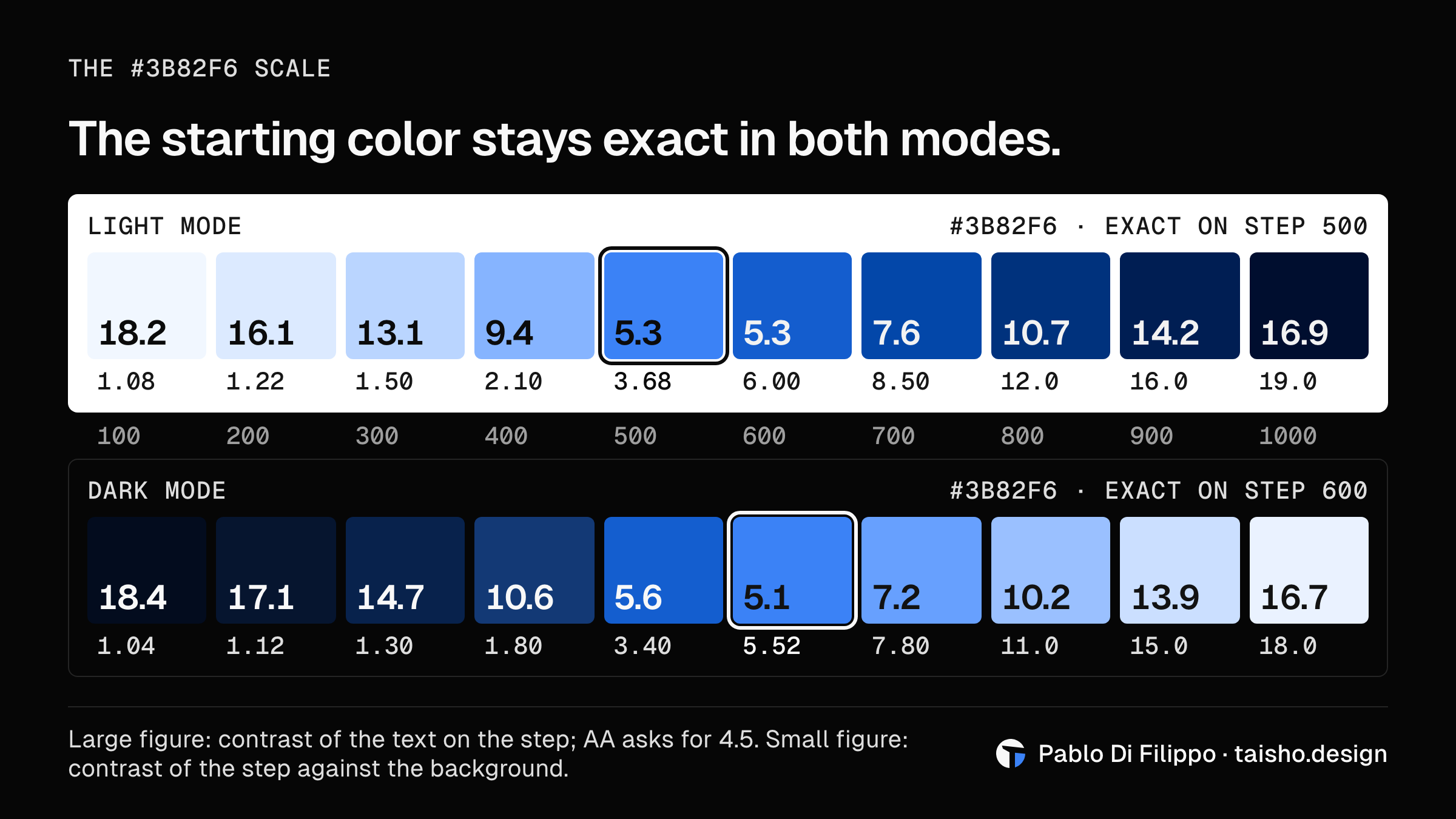
After that, the step number means the same thing in any hue. A 500 stands about as far from the background whether it's blue or yellow, and a 600 holds light text on top in both.
Why evenly spaced lightness isn't enough
The first engine did the obvious thing. It kept the hue and chroma of the brand color, threw away its lightness, and laid out ten fixed OKLCH lightness values, from 0.97 at step 100 down to 0.12 at step 1000. It looked even, and I took it for granted that contrast came out right on its own. That was only an assumption, picked up from what I'd been seeing in the tools around me.
In late October I measured it with 648 colors spread around the hue wheel. For 45 of them, about 1 in 14, at least one step had text on it that fell below AA, and the worst pair, as computed, came in at 4.10. The brand color also never showed up in its own scale: pass in #3b82f6 and you got ten blues, none of them #3b82f6.
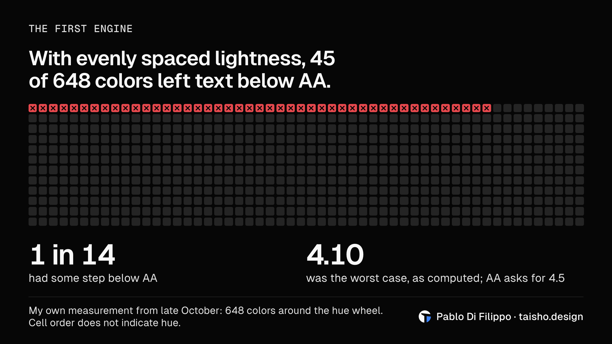
I'm sharing this because mistakes don't embarrass me; they teach me. This one has a simple cause: WCAG contrast is computed from luminance, and two colors with the same OKLCH lightness don't have the same luminance. Evenly spaced lightness gives you a scale that looks orderly and tells you nothing about whether text will be readable.
The same number, in any color
A palette most of us know by heart makes the difference easy to see: Tailwind's. I measured the contrast on white of four of its 500 steps in version 4 (tailwindcss 4.3.5), computed from their OKLCH values. Next to them is the 500 that TaishoDS computes when you start from that same color:
| Color | 500 in Tailwind 4 | 500 in TaishoDS |
|---|---|---|
Blue (oklch(62.3% 0.214 259.815)) | 3.71 | 3.70 |
Red (oklch(63.7% 0.237 25.331)) | 3.82 | 3.82 |
Green (oklch(72.3% 0.219 149.579)) | 2.25 | 3.60 |
Yellow (oklch(79.5% 0.184 86.047)) | 1.93 | 3.60 |
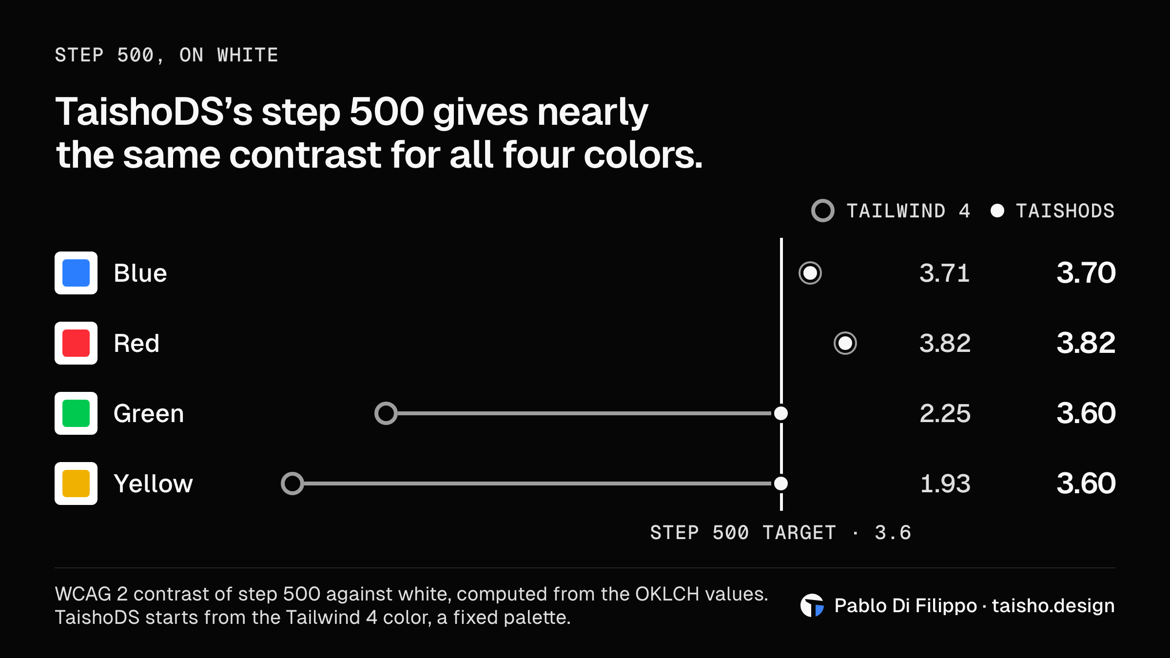
Three of those four colors fall outside sRGB, so their number depends on the screen: on an sRGB screen, the four come out at 3.76, 3.81, 2.22 and 1.91. Tailwind is a fixed palette, which its documentation describes as carefully crafted by expert designers. Going by the numbers, my reading is that each color is tuned to look right and that the step number sorts shades from light to dark without aiming for a fixed ratio. For a palette that ships ready-made, that's a valid choice. I needed a different one because in TaishoDS the color comes from whoever uses the system, and nobody is going to hand-tune an arbitrary hex.
Blue and red already had a step-500 contrast, so they stay there. Green and yellow are lighter: they sit on 400, and their 500 is a computed, darker color. When step 500 holds the starting color it keeps that color's contrast, which can run from 3.0 to 4.2; when it's a computed color, it gives 3.6. Red stays exact. Blue, green and yellow are outside sRGB: TaishoDS keeps them exact in the scale for wide-gamut screens and, in the sRGB scale, lowers their chroma to what that screen can show. That's why blue gets 3.70 and not 3.71.
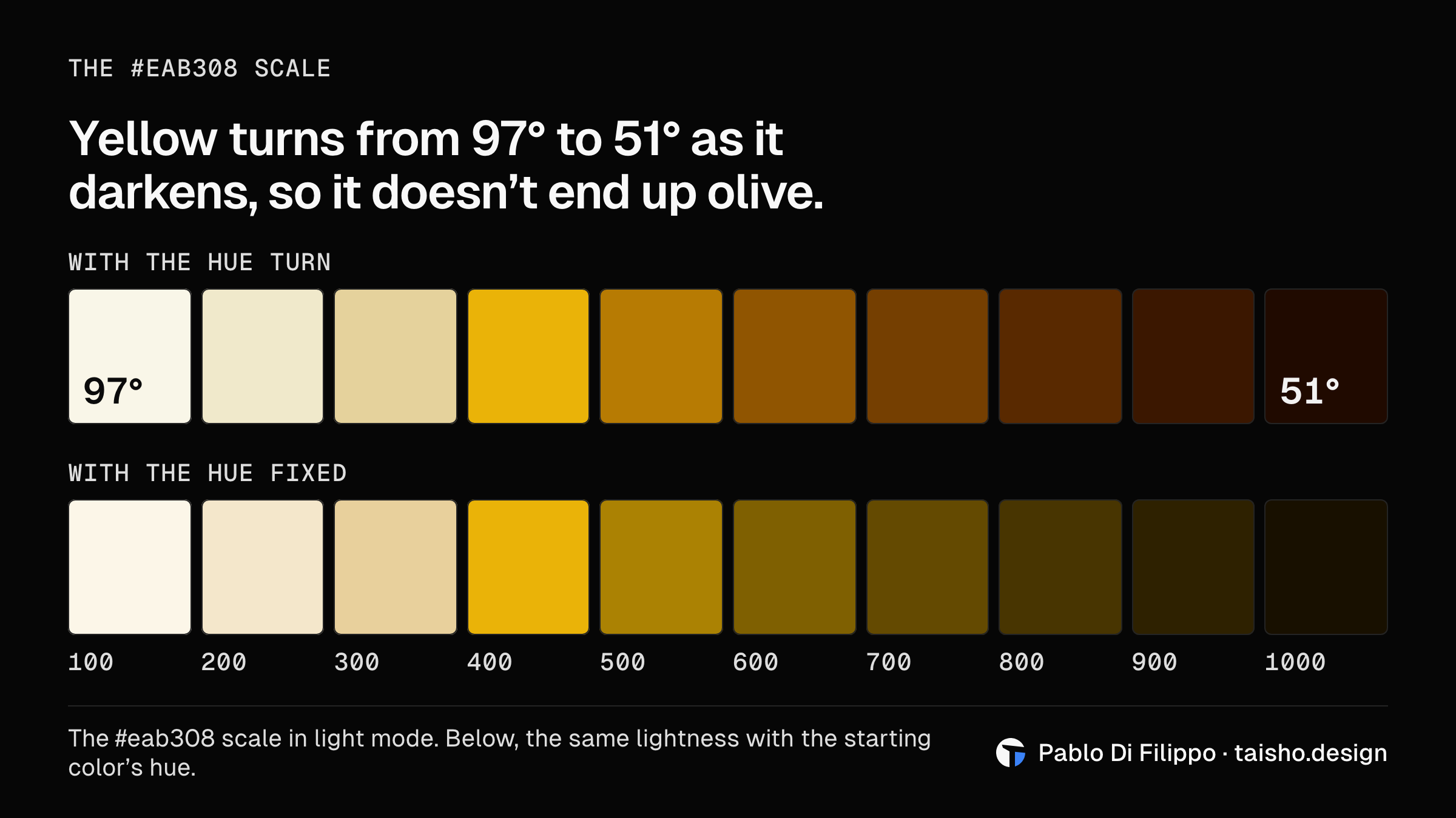
Starting from contrast isn't my idea. Adobe Leonardo generates scales from target ratios, and Material has it built into its tone scale: according to the code of its color library, a tone difference of 50 guarantees a contrast ratio of 4.5:1 or more. From Tailwind and Radix I took something else: both rotate the hue of their yellows as they get darker (Tailwind from about 102° to 54°; Radix, less). My reading is that they do it because a yellow darkened at a fixed hue ends up olive. In TaishoDS, the scale for #eab308 in light mode starts at a hue of 97° on step 100 and reaches 51° on step 1000, close to orange.
Your brand color stays exact
Because dark mode is computed separately, the same color can land on different steps: #3b82f6 is 500 in light mode and 600 in dark. In both it appears exactly as you wrote it, and what changes is the scale around it.
The 4.63 from the top is the worst case in the whole sweep, and it isn't a one-off: nearly 200 scales across different hues give it, all on step 600 in dark mode. One of them is a magenta. That number is the computed one; measured on the colors once they're rounded to the 8 bits per channel a screen paints, the minimum is 4.59.
Where it falls short
Sometimes the engine moves the starting color. Between steps 500 and 600 there's a band of lightness where neither light nor dark text reaches AA on top, and no step aims there. The engine shifts with a margin: in light mode it moves any color that gives between 4.2 and 5.3 against the background, and in dark mode between 4.1 and 5.0, a zone wider than the band. If the brand color falls there, it gets shifted to the nearest edge. In the sweep that happened in 803 of the 8,192 scales, close to 1 in 10. In 521, no text reached AA. In 276, one already did and the color moved anyway, because of that margin. The remaining 6 are white and three near-white yellows, which fall outside the range of the lightest step (100 in light mode, 1000 in dark), and the largest shift was 0.029 in OKLCH lightness, under 3 points out of 100; the editor tells you when it happens and by how much. I decided it that way for two reasons, and both come from the rule at the top. One is that accessibility is a principle in Taisho. The other is how much more that principle is worth when it's computed and adjusted for you.
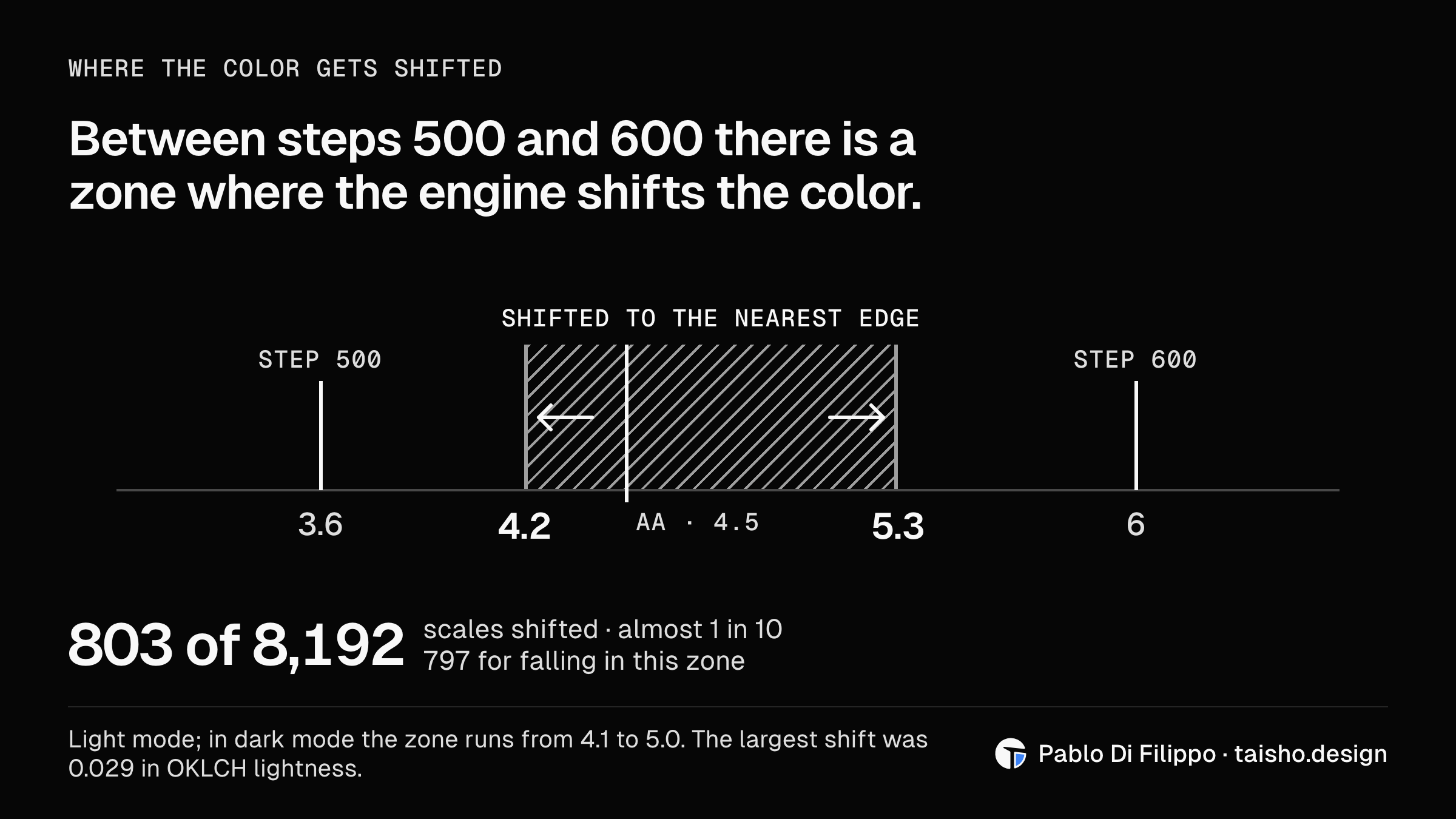
What I measured is each step's text on that same step. Any two colors from the scale, paired with each other, are outside it.
The sweep is also a grid of 16 values per channel, not all 16.7 million colors, and I ran it with the default grays: a theme can tint its grays, and that case isn't in these numbers.
What I found when I rechecked the shift
The rest of this article, before and after this section, describes what the engine does today, with its numbers. This section covers what I found when I rechecked it and what it will do in version 0.17, which I'm already working on. The new numbers are in the table at the end, next to today's.
I went back over the warning the generator prints when it shifts a color, and found two things in the engine, plus a third in my own fix.
A correction can make things worse. The nearest edge can be step 500's, which sits at 4.2 against the background. Of the 797 scales that get shifted for falling in that zone, 401 go to that edge and end up, once shifted, below 4.5 against the background. In 97 of those 401, measured in 8 bits, the color used to reach it. #767676 in light mode is one of them: measured in 8 bits, it has 4.33:1 with text on it and 4.54:1 against the background, and after the shift it has 4.72 and 4.17. Unshifted, that gray reaches 4.5 against the background and can be used as text on the page. Shifted, it can't: the engine takes away something it had. It repairs one measurement and breaks another I wasn't looking at.
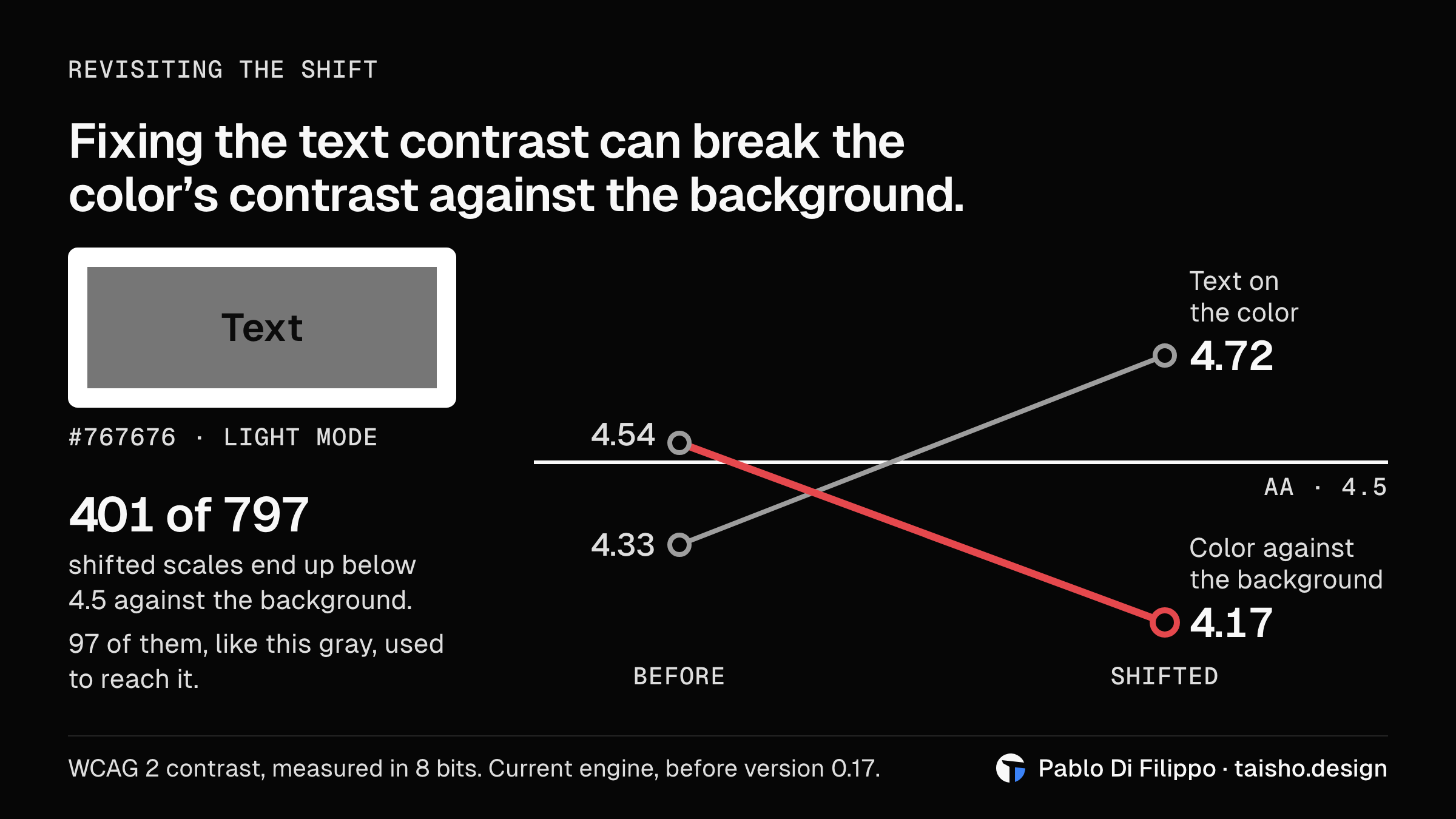
It also moves colors that don't need it, because of the margin from the previous section. #2563EB in light mode gets 4.62:1 with text on it and 5.17:1 against the background, and it gets shifted anyway.
The third isn't in the published engine: it showed up in my fix, while I was working on the other two. The first version compared against the unrounded text gray. For #e22a99 in dark mode it got 4.5000, and what I was calling a pass is 4.48 on the 8 bits per channel the browser paints.
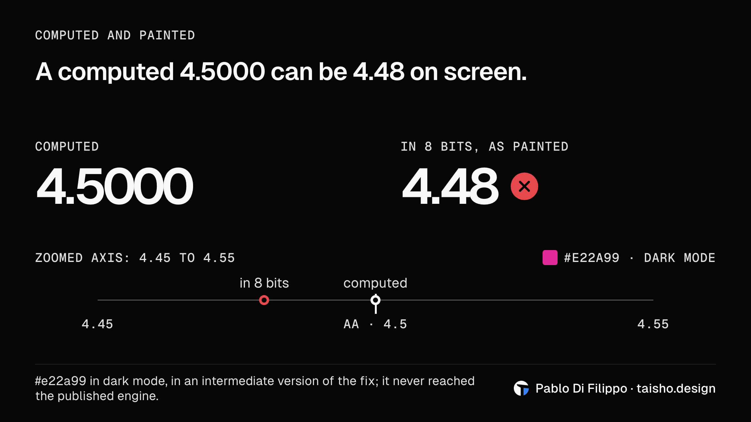
In 0.17 the engine measures both ratios, text on the color and the color against the background, and asks 4.5:1 of each. For a starting color that falls between two steps, and for the edge it would move to, it also measures them in 8 bits; the other steps of the scale stay on the computed value. A color between two steps that meets both stays exact. One that fails either gets shifted to the nearest edge that meets both, in whichever direction that is. If you'd rather keep your exact color even when it falls short, say so in the theme with seedFit: { brand: 'keep' }; 'shift' accepts the move. The warning prints both ratios, before and after, and the line to write.
The cost is that this edge is usually farther away: fewer colors get shifted, but the ones that do move farther. Among the shifted colors in that zone, the average shift goes from 0.013 to 0.030 in lightness, and the largest from 0.029 to 0.059. #767676 gets 0.019 lighter in OKLCH lightness today and will get 0.037 darker in 0.17. The lowest text contrast drops too, from 4.63 to 4.50, because colors that only just pass are no longer moved. Here's the same sweep, 4,096 colors and 8,192 scales, on today's engine and on 0.17's:
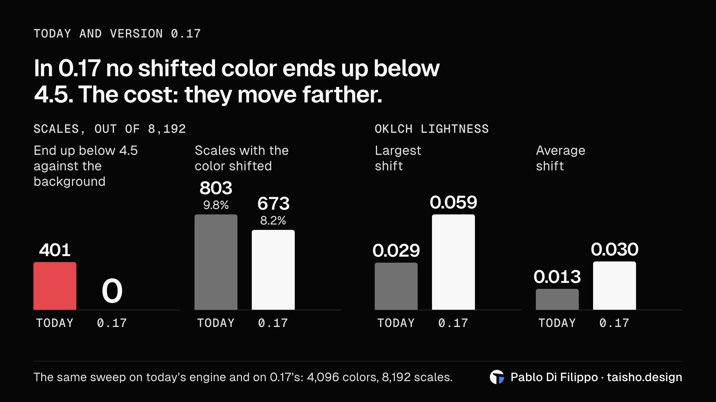
| Today | Version 0.17 | |
|---|---|---|
| Lowest text contrast, computed | 4.632 | 4.501 |
| The same minimum, measured in 8 bits | 4.588 | 4.505 |
| Steps with text below 4.5 | 0 | 0 |
| Scales with the color shifted | 803 (9.8%) | 673 (8.2%) |
| Shifted scales that end up below 4.5 against the background | 401 | 0 |
| Colors between two steps that stay exact | 0 | 130 |
| Largest shift, in OKLCH lightness | 0.029 | 0.059 |
Lines in palette.ts | 351 | 424 |
Try it
The quickest way is the homepage. It has a theme editor with a field where you can type a hex, and the whole page repaints with that color, with each step's text contrast shown. The editor calls the same function the package ships, which applies the theme in the browser without compiling CSS, in a project that already bundles its modules:
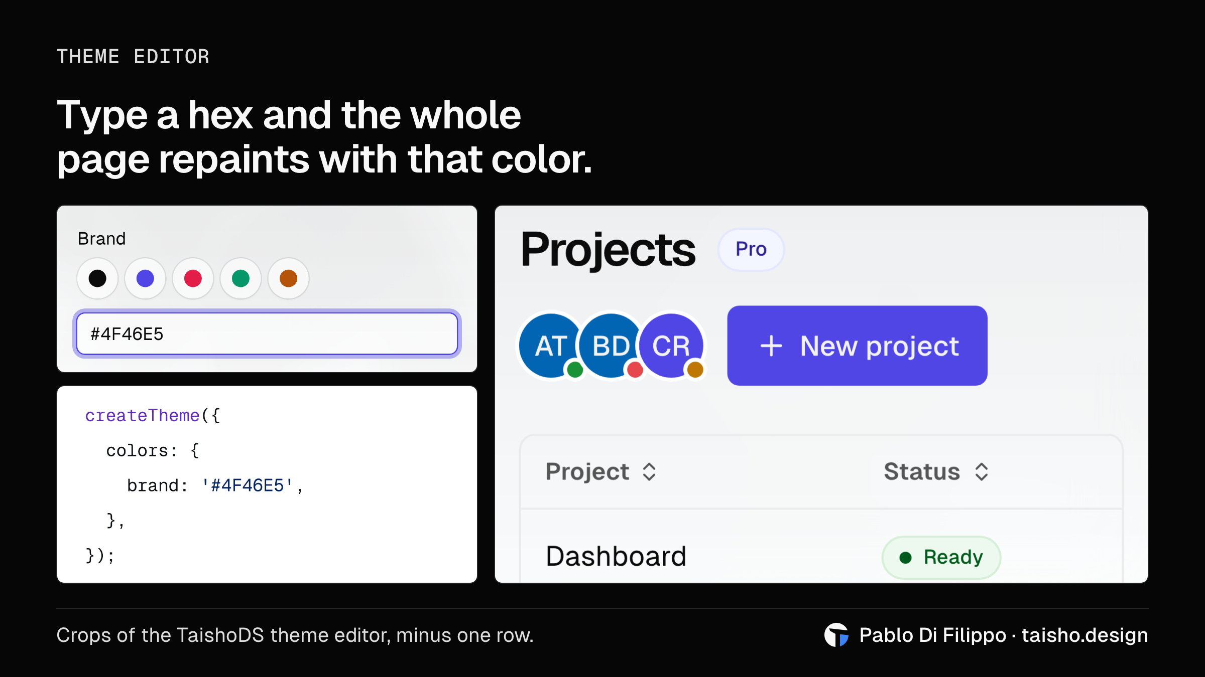
import { createTheme } from '@taishods/core';

createTheme({ colors: { brand: '#4F46E5' } });
To use the whole system there are two routes. From a CDN it's three lines of HTML, listed in the installation guide, and nothing to install. With the package, the CSS is compiled with your own colors and fonts:
npm i -D @taishods/core
npx taisho init
npx taisho generate
It needs Node 22.18 or newer.
I started this because I didn't want contrast to depend on me remembering to check it on every project. For color, it no longer does: I pick one and the system works out the rest. It's only one part of a design system, but it's the part that convinced me the rule could actually be kept.
The engine lives in src/lib/theme/palette.ts in the repository, about 350 lines. If a color breaks it, I'd like to see it: open an issue on the repository with the hex and the mode where it fails.